
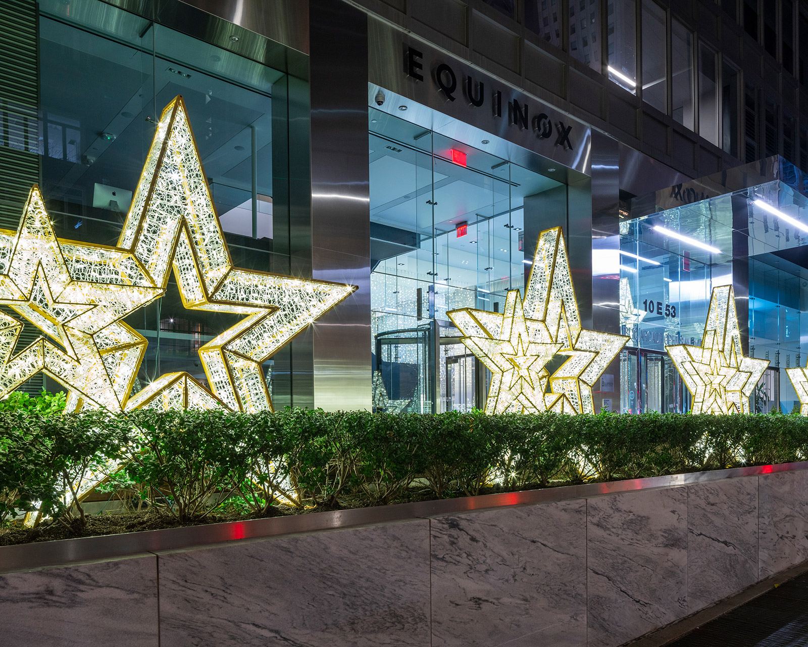
From Midtown office towers to Long Island City residential lobbies, commercial holiday decor is one of the only times each year a property’s public spaces change character. For a few weeks, the lobby, the plaza, or the storefront becomes the clearest signal of how a building wants to be seen.
Too often, that signal says nothing in particular. The tree looks fine, the lights are bright, the garland is fresh, but none of it connects back to the building’s brand, architecture, or tenants. Swap it into the building next door and no one would notice.
For NYC building managers, that is a missed opportunity. This kind of decor is one of the most visible investments a property makes all year, seen by every tenant, visitor, and prospective client who walks through the door. When treated as a strategic branding opportunity instead of a routine seasonal chore, it delivers a return on investment that far exceeds its cost.
The following tips explore color and material choices that build a brand-aligned palette, how building type and tenant mix should shape the design, how to carry a single look across an entire property, and what NYC building managers need to plan for on the compliance and logistics fronts.
What Makes Holiday Decor Read as “On Brand”
Brand alignment rests on three core pillars:
- A cohesive visual system: Combining color palette, form, and material choices.
- An intentional emotional tone: Ranging from understated sophistication to vibrant, festive energy.
- A strategic placement plan: Directing attention purposefully throughout the property, from focal lobby features to subtle accents near service entrances.
A generic approach relies on stock red and green, off-the-shelf wreaths, and pieces added on top of last year’s, with no real direction behind them. A brand-led approach starts from the building’s identity and works outward. Every element, down to the ribbon and the ornament finish, ties back to a recognizable identity.
None of this means putting a logo on a wreath. The strongest holiday programs carry a brand’s character through design language alone, its colors, its materials, how restrained or exuberant it is, never through a literal marketing display.
How Color, Materials, and Form Connect Decor to Your Brand
Three design levers do most of the work in tying a holiday program back to a building’s identity.
1. Color
Build the holiday palette from what’s already in the building, not a generic seasonal default. A cool, minimalist lobby can carry its silver and charcoal tones into December, adding warm metallics and a single accent color to mark the season without disrupting the space. A warmer, more traditional lobby has room to lean into deeper reds and greens, as long as they still read as a choice and not a default.
2. Materials
What a display is made of says as much about a building’s positioning as its color palette does. Lush evergreen elements, frosted foliage, high-end ornament finishes, and refined textiles subtly communicate a building’s elite status. They also have to hold up under real conditions: heavy lobby foot traffic, drafts from revolving and swinging entry doors, and, outdoors, the freeze-thaw cycles that can wreck lower-quality materials within a single season.
3. Form and scale
Scale, silhouette, and lighting temperature do the rest. A tall, narrow tree with a tailored shape and cool white lighting sets a different mood than a full, layered tree lit warm, and the right call depends on the building and who moves through it.
Your Building’s Architecture Sets the Constraints
Selecting effective holiday decor requires analyzing the physical space first. Elements like ceiling height, natural lighting, flooring, millwork, and main entrance sightlines dictate precisely where installations will stand out or fade away.
A display that fights the building’s existing materials creates visual noise. A brushed-metal-and-stone lobby with decor in mismatched finishes will feel off, no matter how well the pieces themselves are made. Matching those finishes makes the display feel like part of the building instead of something set down inside it.
This matters most in landmarked and prewar buildings across Manhattan and Brooklyn, where installation methods and attachment points are often limited by the structure itself and by preservation rules. For these properties, it’s paramount that the design direction accounts for this early, before a concept is locked in.
Tailoring Commercial Holiday Decor to Building Type and Tenant Profile
The right brand expression also depends on who actually uses the building. A design built for a corporate headquarters won’t necessarily work for a residential co-op, and the reverse is just as true.
- Class A office towers and corporate headquarters: Restrained, architectural displays that photograph well and reinforce a professional tenant experience, with attention to lobby circulation and security desk sightlines.
- Residential co-ops, condos, and HOAs: Warmer, more traditional programs that serve residents and families, where board consensus and multi-year design consistency matter as much as the design itself.
- Retail, hospitality, and mixed-use properties: Higher-impact, engagement-driven installations, including photo moments and window displays, that support foot traffic during the strongest retail weeks of the year.
- Healthcare, academic, and institutional campuses: Inclusive, welcoming decor that avoids narrow religious framing while still creating a sense of occasion, with strict attention to egress, fire safety, and infection control requirements.
One Design Language Across Every Space
While an impactful lobby display sets the initial tone, transforming holiday decor into a lasting brand asset requires extending that design narrative throughout the entire property.
To avoid overwhelming the space while maintaining visual harmony, secondary areas such as entrances, plazas, elevator banks, and amenity floors should reflect the primary color palette and essential materials with a subtler intensity.
This structured flow ensures that the journey from the exterior entrance to the upper floors feels cohesive and intentional rather than fragmented.
This framework easily extends across entire portfolios. Asset managers can establish a unified brand identity across multiple buildings while adapting the scale and layout to suit each location’s specific architecture and tenant demographics.
Establishing a multi-year program further enhances sustainability and efficiency. Storing and reusing high-quality core inventory, with subtle seasonal variations, provides tenants with a sense of continuity while eliminating the expense of starting from scratch each year.
Timing, Compliance, and Logistics in New York
Design has to fit inside a real calendar, and NYC properties face a specific set of planning and operational realities that shape what’s possible.
The typical sequence runs with design direction and approvals in late summer, fabrication of any custom pieces through early fall, installation within a set window in November, and removal and storage scheduled before the year’s end.
Tip: For a closer look at how far in advance that process should start, read our article, How early should NYC building managers start planning holiday decor?
A handful of operational requirements tend to define the scope of a project once it moves past the design phase:
- Certificate of insurance (COI) standards required by the building or management company
- Freight elevator reservations and defined access windows
- Union labor regulations, where they apply to the property
- Exterior and sidewalk permits for anything facing the street
- Power constraints
Oversized trees, suspended features, and exterior lighting need professional installation, both for safety and to stay code-compliant. A partner who handles design, installation, removal, and off-season storage as one program takes that coordination off building staff and keeps the look consistent season to season.
Seasonal Decor That Never Reads as Generic
Commercial holiday decor is one of the most visible signals a property sends to tenants, visitors, and anyone walking by. Getting it aligned with the building’s brand is what separates a display people actually remember from one they walk past.
Investing strategically in this area pays dividends far beyond the holiday season by enhancing the tenant experience, strengthening brand recognition in key areas, and establishing a durable design model that continues to adapt and grow over time.
Cambridge has spent more than two decades designing tailored commercial holiday decor and lighting programs for commercial real estate across Manhattan, Brooklyn, Queens, Westchester, Long Island, and the broader tri-state region. Contact the team today to request a consultation and start planning a program built around your property’s brand.